The Hidden Problem in Most Landing Pages
Why Visitors Don’t Convert Into Leads

A detailed breakdown of why most landing pages fail to convert even when they receive good traffic, and how small structural and psychological gaps silently reduce lead generation performance. This guide explains the real issue behind low conversions and how to redesign landing pages for clarity, focus, and measurable business outcomes.
Introduction: Why Landing Pages Fail
Most landing pages do not fail because of poor design tools, weak platforms, or lack of traffic. They fail because of something far more fundamental: a breakdown in clarity and focus. Businesses often assume that once users arrive on a landing page, conversion will naturally follow if the design looks modern or visually appealing. In reality, users make decisions within seconds, and any confusion during that moment leads to immediate drop-off.
A landing page is not just a digital page—it is a decision environment. It is where attention must be converted into action without distraction. However, many landing pages end up becoming overloaded with unnecessary information, unclear messaging, or competing calls to action, which creates friction instead of guiding the user toward a single outcome.
Understanding why landing pages fail requires looking beyond aesthetics and into structure, psychology, and user intent alignment. Once these elements are understood, conversion optimization becomes significantly more predictable and systematic.
What Is a Landing Page?
A landing page is a dedicated web page designed with a single focused objective, usually to convert visitors into leads or customers. Unlike a homepage, which serves multiple purposes and audiences, a landing page is built around one specific action such as filling out a form, booking a consultation, or making a purchase.
The effectiveness of a landing page depends on how clearly it communicates value and how efficiently it removes friction from the decision-making process. Every element on the page should support the primary conversion goal, with no distractions or competing messages that pull the user in different directions.
In digital marketing systems involving SEO, Google Ads, and social media campaigns, landing pages act as the final conversion point where traffic is transformed into measurable business results.
The Hidden Problem: Lack of Focus
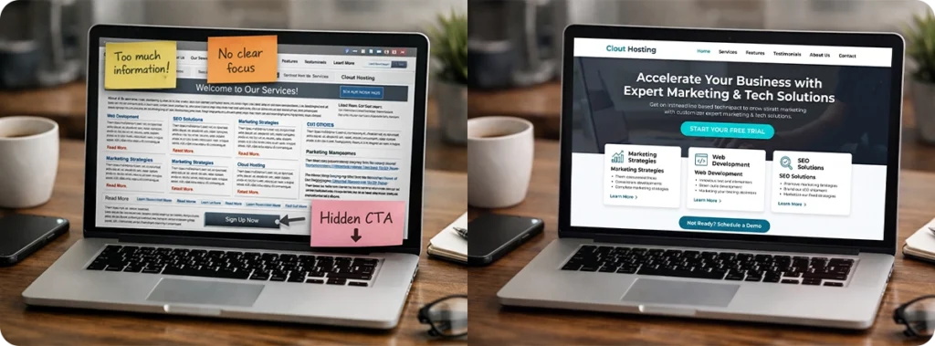
The most common and often unnoticed problem in landing pages is lack of focus. Many businesses try to communicate too much information at once, assuming that more details will increase trust or persuasion. Instead, this overload creates confusion and reduces the likelihood of action.
When a landing page lacks focus, users are forced to interpret what the main goal is, rather than being guided toward it. This cognitive effort increases friction and leads to decision fatigue. In most cases, users simply exit the page rather than trying to figure it out.
A high-performing landing page eliminates this problem by maintaining a single clear objective throughout the entire structure. Every section reinforces the same message, and every visual element supports one conversion path.
Signs Your Landing Page Is Not Converting
One of the most obvious signs of a weak landing page is high traffic combined with low conversion rates. If users are clicking through from ads or search results but not taking action, the issue is usually not traffic quality but page experience.
Another common sign is high bounce rates, where users leave the page within a few seconds without interacting. This typically indicates that the page failed to immediately communicate relevance or value.
Low engagement, such as minimal scrolling or no interaction with CTAs, also signals that users are not being guided effectively through the content. In many cases, these issues are not visible at a surface level but become clear when user behavior is analyzed properly.
The Psychology of Landing Page Design
Effective landing page design is deeply rooted in human psychology. Users do not read landing pages line by line; they scan for relevance, clarity, and trust signals. Within seconds, they decide whether to stay or leave based on how quickly they understand what is being offered and whether it aligns with their intent.
Cognitive load plays a major role in this decision-making process. When a page contains too many elements, competing messages, or unclear hierarchy, it increases mental effort, which reduces conversion probability. On the other hand, simplified and structured layouts reduce friction and guide attention naturally toward the desired action.
Trust is another critical psychological factor. Users are more likely to convert when they see credibility signals such as testimonials, recognizable proof elements, or clear demonstrations of value. Without trust, even well-designed pages struggle to perform.
Key Elements of a High-Converting Landing Page
A high-converting landing page is not built on complexity but on clarity and structure. Every element serves a specific purpose in guiding the user toward conversion.
Headline
The headline is the first and most important element on the page. It determines whether users continue engaging or leave immediately. A strong headline communicates the core value proposition clearly and instantly answers the question of what the user will gain.
Offer
The offer defines what the user receives in exchange for taking action. If the offer is unclear or poorly positioned, users lose interest quickly. A strong offer focuses on outcomes rather than features, making it easier for users to understand the value.
CTA
The call-to-action is the conversion trigger of the landing page. It should be clear, visible, and aligned with the user’s intent. Weak or hidden CTAs create unnecessary friction and reduce conversion rates significantly.
Trust Elements
Trust elements such as testimonials, case studies, or credibility indicators help reduce hesitation. These elements reassure users that they are making the right decision and increase confidence in taking action.
Common Mistakes (With Examples)
One of the most common mistakes is adding too much information to a single landing page. Instead of guiding users toward one action, businesses often overload pages with multiple services, links, or competing messages, which reduces clarity.
Another frequent issue is weak messaging hierarchy, where the most important value proposition is not visible immediately. Users should not have to scroll or search to understand what the page is about.
Poor CTA placement is also a major conversion blocker. When the action button is not clearly visible or repeated strategically across the page, users often leave without converting even if they are interested.
How to Improve Your Landing Page Conversion Rate
Improving landing page performance starts with simplifying the structure and focusing on one clear objective. The first step is refining the headline and ensuring it communicates value instantly without ambiguity. Once the core message is clear, the offer should be aligned with user intent and presented in a way that emphasizes outcomes rather than technical details.
Next, the page structure should be optimized to guide attention naturally toward the call-to-action. This includes removing unnecessary distractions, improving content hierarchy, and ensuring that CTAs are visible at logical decision points.
Finally, trust elements should be integrated strategically to reduce hesitation without overwhelming the page. When these elements work together, conversion rates improve not by adding more content, but by removing friction.
Conclusion: Simplicity Wins
The biggest misconception in landing page design is that more information leads to better conversions. In reality, clarity consistently outperforms complexity. Users do not need more content—they need better direction.
A high-performing landing page is built on focus, structure, and psychological alignment with user intent. When these principles are applied correctly, the page becomes more than just a digital asset; it becomes a controlled conversion environment.
In modern digital marketing, simplicity is not a design choice—it is a performance strategy.